

This is not a genocide!

They claimed millions died from ‘covid’; let’s not be as guilty as them and invent millions dying from the vaccine, when it’s not supported by the evidence.
The vaccines are definitely killing people.
However excess mortality is not the same as the death rate. Excess mortality is the number of people who died in a given period compared to the average of the previous 5 years for that period, and therefore depends whether the previous years were high or low deaths.
A ‘preprint’, non-peer reviewed (and never likely to be) paper from Denis Rancourt Probable causal association between Australia's new regime of high all-cause mortality and its COVID-19 vaccine rollout
The excess mortality in the vaccination period (mid-April 2021 through August 2022) was 14% larger all-cause mortality than in recent pre-vaccination periods of same time duration.
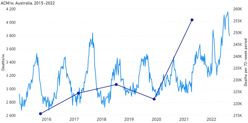
A crude estimate of deaths per week can indicate that something is happening; as in this graph from the paper.
However we need to take into account the increase in population. The population in Oz in 2021 was 25,422,788 and there were 171,469 deaths; a rate of 0.674%.
The population in 2022 was 26,124,814 (up to 30th September) (a 2.76% increase; flight restrictions meant that many had been unable to leave) and there were 174,717 deaths up to 30th November and registered by January 2023; a death rate 0.668%.
It seems that the death rate has actually fallen from 2021 to 2022 by 0.006%.
An attempt was made to take the population size into account with this graph also from the paper which shows deaths per million.
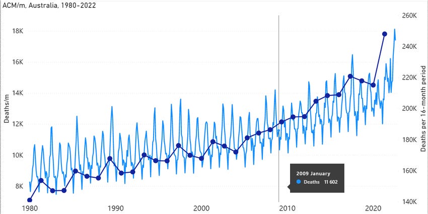
However, all cause mortality also needs to be adjusted for the increasing age of the population, as the older the population is; the more likely people are to die. The graph above from the paper is not age adjusted. Populations of countries, counties or states that have a low and/or declining birth rates will contain an increasing proportion of elderly people. Thus whatever the health measures, good, bad or indifferent; the death rate will keep going up and up.
In fact the age standardised all cause mortality for Australians has significantly decreased, at least for Non-Indigenous ones.
‘Over the decade from 2010 to 2019, the age-standardised all-cause mortality rate did not change significantly for Indigenous Australians but decreased by 8.6% among non-Indigenous Australians. This resulted in a widening of the absolute gap by 18% over this period.
In 2019 there were 393 per100,000 more deaths for indigenous people compared to non-indigenous people living in the same country. I feel that deserves a pause.

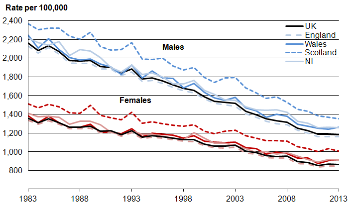
Here is the are the age standardised rates of death per 100,000 for the UK from 1983 to 2013.
Here is the increase of 0.128% in the (midazolam and ‘end of life care’ deliberate dehydration induced) murder rate in England and Wales between 2019 and 2020.

In England and Wales 2021 saw a 0.04% decrease in death rate, 2022 saw a further 0.02% decrease in deaths from 2021 and a further 0.01% decrease from 2022 from 2023.
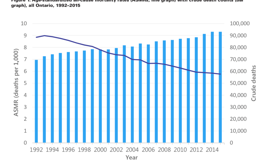
Here is another example of how confusion arises; the graph below shows crude deaths against age standardised all cause mortality. The deaths (in blue) seem to be increasing but the age standardised mortality per 1000 (in purple), the death rate, is in fact significantly decreasing.
And another case in point regarding excess mortality from Joel and Japan.
This all cause mortality graph is neither population nor age adjusted. The birth rate and population of Japan appears to be declining, the proportion of those who are elderly and therefore more likely to die, is getting higher and higher. All cause mortality will go on rising whatever the health policies unless the graph is adjusted for age.
The age adjusted death rates in Japan are actually falling Why has Japan become the world’s most long-lived country: insights from a food and nutrition perspective)

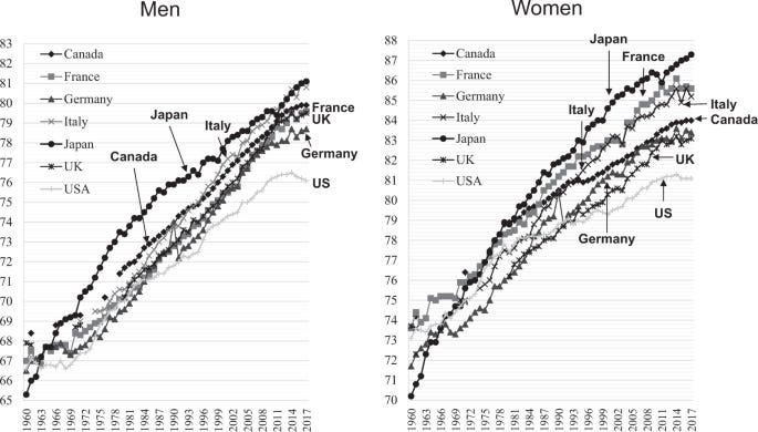
This is further born out by the increases in life expectancy between counties with Japan doing very well
Life expectancy was reduced very slightly, by a few months, in 2021 Life Expectancy in Japan Falls for the First Time in a Decade

The life expectancy is still 87.57 for women and 81.47 years old for men. That’s amazing! Updated 2023; in 2022 the life expectancy in women in Japan fell again (the first time since 2010 to 2011) by six months to 87.09 years old, and that of men fell by 3 months to 81.05 years. Still pretty healthy.

It cannot be expected that the death rate will continue to decline nor the life expectancy continue to increase indefinitely. The United States population has increased by nearly 4 million from 2019 to end of 2022.
Have there be 17 million deaths from the jabs???
I struggle with the 17 million figure and sanity. 17 million 'excess deaths' due to a new factor indicates the death rate would have to have risen over and above the 'normal' number of deaths by 0.07% each year, or 0.21% overall from 2021 to 2023.
It has clearly not done that. In E and W the death rate was 0.892% in 2019, 1.02% in 2020, 0.98% in 2021, 0.96% in 2022 and 0.95% in 2023 . This represents an increase of 0.19% overall over the very low death year of 2019, so 90% of the number of deaths required (and not age adjusted so in reality even less).
Of this 15.3 million ‘extra’ deaths, if E & W extrapolated to the world, only 5.5 billion were jabbed leaving us with 10 million deaths possibly from jabs.
We are asked to believe that ALL of these so called ‘extra’ 10 million (out of 183 million) deaths over three years (when compared to one unprecedentedly low death year) were caused by the jabs and not the on going effects of lockdowns, loneliness, ageing, junk food, lack of exercise, stress or flu jabs. This is nuts.
We are not making out that the jabs are less harmful than they are, just appealing to science and sanity
I maintain that the vaccines, health policy and drugs are designed to make us sick and permanently on more drugs; not to kill us all. For income generation; not genocide.
How what appears to be significant increases in the percentage of excess deaths do not represent distinct increases in deaths over a ‘normal range’, they are relative and must be population and age adjusted, so they will appear to increase whatever the health policies.
Norman Fenton warned about seeing significant increases in excess deaths when they were not really so when applied to covid but seems to have forgotten it when applied to the jabs. When looking at the significance of the crude number of deaths, the size of the increase compared to size of the variation that’s gone before as well as the size of the population must also be considered.
One cannot ascribe any ‘extra’ deaths, let alone all of them, to one factor or variable among thousands in the lives of humans. It is ridiculous. And the deaths are not ‘extra’ they are just a number relative to what has gone before and will always increase in an ageing population.
Update for 2023 deaths

And the continued manipulation with propaganda

🐒
The all-cause mortality angle has tripped me up a few times already. I wonder if what I had looked at prior took into account the growing and aging population or if that obscured the issue at hand. On my own journey to realizing vaccines could be more dangerous than the virus (let's table the debate on the existence of virus' for a second) had me run into a standoff between Kirsch and Crawford vs. a Medium Series that goes by the pretentious name as 'the gift of fire'. The Gift of Fire people said there wasn't enough room in all cause mortality for Kirsch's estimates of vaccine death. And they through a 100 graphs at the reader then ended by comparing all those critical with the pandemic to QAnon conspiracy theorists. I'd love to hear what you would make of their analysis and graphs that didn't make sense to me. https://medium.com/microbial-instincts/debunking-steve-kirschs-latest-claims-97e1c40f5d74
Thanks for reminding us of the complexity of calculating excess deaths!